
Showing posts with label Installation. Show all posts
Showing posts with label Installation. Show all posts
Friday, 17 February 2012
Recorders Down Under

Tuesday, 22 March 2011


Sunday, 21 November 2010
Recorders
Manchester Art Gallery,
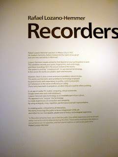


Finally, I have been to see the 'Recorders' exhibition at The Manchester Art Gallery. I thoroughly enjoyed the interactive element of the exhibition, this combined with my obsession with recording devices enhanced the experience. I have officially bookmarked Rafael Lozano-Hemmer.
Gastrotypographicassemblage.
In 1965 Lou Dorfsman and Frank Stanton stood contemplating the black wall of the blank wall of the new CBS cafeteria. The mundane design proposals submitted for the wall fell below their expectations, and they were determined to find a more original concept...


Exhibition catalogue from exhibition.

CBS feature from U&LC
Wednesday, 17 November 2010
Du Ho Soh
 Bridging Home is a scale model of the artist's own Korean house from his childhood wedged between two buildings on Duke Street, Liverpool.
Friday, 12 November 2010
Damien Hirst, PHARMACY Restaurant + Bar


 Designers and restaurants. Something I have been pondering in my consideration of the ISTD brief: Muttod Quad, my task? To design a typographic restaurant. I am undecided as to whether this brief is a branding venture, an interior design challenge, research into 'Alphabetti Spaghetti' or a way to use a specific topic, in this case, Gastronomy and explore it typographically.
I am leaning towards the latter. A branding task may be appropriate if asked to re-design a restaurant, but this notion of a typographic restaurant, suggests the need for more than understated elegance and culinary clichés. Perhaps clichés will be embraced, exaggerated, exploited or avoided completely. Does the restaurant have to physically exist, could it be a fantasy land, magical, surreal? What would a typographic waiter look like? how would the walls be decorated?Lampshades, cutlery, candles, menus, bar signs etc etc....the possibilities are endless.
As a starting point I have been looking at Damien Hirst's Pharmacy Restaurant + Bar, Hirst has taken the theme of pharmaceuticals and applied it to a restaurant environment. The venue appears clinical, sanitary, stark, yet there is something intriguing an complex about display cabinets of over the counter drugs, signage in turquoise neon and chairs of waiting room standard, a complete parody of a pharmacy. The whole experience seems as though it would be quite jarring and possibly unenjoyable, but at least you can say 'I went to Damien Hirst's Pharmacy' I have no idea if the food tastes good, but is that what the 'Designer's Restaurant' is about. Who cares what the food tastes like as long as it's making history? Hirst's restaurant opened in Notting Hill, London in 1997. After breaching the Medicines Act, 1968, which restricts the use of "pharmacy". The restaurant's name was subsequently changed to "Army Chap", and then "Achy Ramp": anagrams of "Pharmacy". The restaurant itself closed in September 2003. Hirst, who had only loaned the restaurant the artwork on display on the premises, went on to pocket over £11 million when the items were auctioned at Sotheby's
Wallpaper Calender
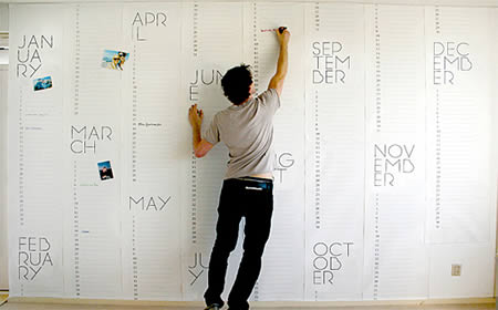
Dutch designer Christiaan Postma designed this wallpaper to do double duty as a giant calendar. The design merges the properties of wallpaper with the functionality of the calendar to create a wall that is a true reflection of our busy schedules. By making the calendar so large you can literally look at one whole year on your wall, giving an entirely different perspective of time.(Link)
 This wallpaper called Pocket Wall by designer Maja Ganszyniec is like a wrapping paper. The project turns the purely decorative layer of wallpaper into storage. (Link)
 See more creative wallpapers here
Wednesday, 6 October 2010
Recorders
- Manchester Art Gallery
Saturday 19th September - Sunday 30th January
 I have had an obsession with vintage recording devices since I began my foundation. In the past I have explored recorders of sound and then later trying to devise a new type of communication, by literally trapping sound. So naturally I was interested in visiting Rafael Lozano-Hemmer's, Recorders exhibition at the Manchester Art Gallery. Filled with an array of recording devices via seven interactive installations.
 The first room displays rather modest installations which are amusing to participate with. Exploiting the idea of sharing information, placing this experience into a physical space, makes us aware of the information we are sharing, mirroring the way we share information everyday, but in a more obvious way. the highlight of the exhibition is undoubtedly the pulse room, It is rare, if ever, that we are able to actually visualise our pulse, it is usually experienced through sound or feeling. A ceiling is gridded with hundreds of light bulbs, at the head of the room there are two metal handles, the visitor is invited to grab hold of the handles and then watch as the lights in the room respond to their unique heart rate, for a moment, the room represents the visitor, allowing them to see their pulse illuminated on a large scale. I found this experiential exhibition engaging a mixture of recording, ambience, light bulbs and interaction, in my opinion, is worth a visit!
Saturday, 2 October 2010
Sachiko Abe
 (b. Japan, 1975)
I visited the Liverpool Biennial this week. Many of the things I saw were disappointing, however the undoubted highlight was Sachiko Abe. Tucked a way in a corner of FACT is a performance not worth missing. Paper Mountain was the name of the performance, I walked into a warehouse type room to find a beautiful turret of paper, which on closer inspection was made up of tiny shreds of paper, glancing further I saw a woman dressed in white at the top of a mezzanine, cutting into an A4 sheet of paper under a pale spotlight. The intricacy of the piece was fascinating, Abe cuts around the edge of the A4 sheet forming a delicate thread of paper which cascades from the mezzanine and trails to form the paper mountain, which is merely supported by string. A microphone amplifies the cutting sound and I got a great sense of time and presence within the performance. As if Abe had been there for years creating this sculpture, serenely and slowly, part of a fairytale, divine and somewhat magical.
(b. Japan, 1975)
I visited the Liverpool Biennial this week. Many of the things I saw were disappointing, however the undoubted highlight was Sachiko Abe. Tucked a way in a corner of FACT is a performance not worth missing. Paper Mountain was the name of the performance, I walked into a warehouse type room to find a beautiful turret of paper, which on closer inspection was made up of tiny shreds of paper, glancing further I saw a woman dressed in white at the top of a mezzanine, cutting into an A4 sheet of paper under a pale spotlight. The intricacy of the piece was fascinating, Abe cuts around the edge of the A4 sheet forming a delicate thread of paper which cascades from the mezzanine and trails to form the paper mountain, which is merely supported by string. A microphone amplifies the cutting sound and I got a great sense of time and presence within the performance. As if Abe had been there for years creating this sculpture, serenely and slowly, part of a fairytale, divine and somewhat magical.In a separate room there appeared intricate and obsessional drawings. Obviously a theme running through Abe's work. One drawing was on a roll of paper, unfinished. still a vast amount of unrolled paper to work through and two pillows set down on the floor. it was the sense of time which struck me again and the uncertainty of a finished piece. I found the work very calming as if Abe had an escape and was separate from the stresses of life and exists purely for her work. It was this authenticity that I admired the most.
Wednesday, 25 August 2010
The Surreal House

 Review:
A wall collapses here, a door upends over there. An egg-shaped abode hides a womb-like interior and there's a creeping suspicion that all is not well at home. 'The Surreal House' is an ambitious and rewarding, if necessarily sinister peek into some of the most bizarre dwellings imaginable - its scope grand enough to include art, architecture, film and photography, while its atmosphere close and cloying enough to induce moments of sheer terror and genuine delight.
Film emerges as the most powerful medium in 'The Surreal House' with Jacques Tati's hapless 'Mon Oncle' and Jean Cocteau's 'La Belle et La Bête' contrasting the ridicule of modern living with a wildly romantic fairy tale fantasy - but both require that you watch them in their entirety in a specially built cinema. The show proper opens with Buster Keaton's famous slapstick sequence from 'Steamboat Bill Jr', in which his own house is blown down around his ears, and leads you to the objects contained within the Barbican's custom-built structure. Yet neither a pair of Duchamp's darkened French windows (called 'Fresh Widow') or his cheeky rubber-foam boob in place of a doorbell, give any real clues as to what's inside. The initial shock then comes when presented with a blacked-out bathroom, where Rachel Whiteread's sepulchral resin cast of the space under the tub greets visitors with our own grubby mortality.
A spyhole refuses to reveal the secrets behind Sigmund Freud's front door, but the meister of repression's office chair is here in his stead. Alas, we soon get Freud's massively overused theory of what makes a surreal house a home for nasty memories practically shoved down our throats. His notion of the unheimlich, or unhomely, is appropriate in this context, but is little more than paying lip service to art-speak cliché - it's now shorthand for anything a bit 'strange' in contemporary art.
The earliest spaces to mimic Freud's ideas were the original and best surreal houses: André Breton's elegant apartment shelves appear on camera, filled with a curio collection of the highest order (shamefully auctioned off piecemeal in 2003) and none other than the 'Great Masturbator' himself, Salvador DalÌ, created some of the most outlandish and unreal environments, not least his 'Dream of Venus' pavilion created for the 1939 New York World's Fair. Trying to marry DalÌ's paintings with later architecture is a major mistake, however, especially in the nonsensical pairing of his 1937 'Sleep' with Rem Koolhaas's villa on stilts from 1991, chiefly because it does the overarching theme no favours at all.
Everything takes a surreal turn for the better when the curators play, not at intellectual ping-pong or tenuous connect-the-dots, but at impressive interior design. A crumpled, clanking piano by Rebecca Horn hangs from the parlour ceiling, a locked door guards an artist singing as he wipes on the toilet, a lonely window stares down on an unloved Sarah Lucas mattress in the bedroom, while Jan Svankmajer's troubling nursery of animated toys is a welcome burst of colour in an otherwise monochrome world. Not every allusion works - Maurizio Cattelan's sorely punished mannequin boy with pencils stuck through his hands is no more than a lame joke, as is Edward Kienholz's waiting room, in which the armchair resident has long ago been reduced to a dusty skeleton. Without the drama of the house motif to its layout, the upper floor suffers badly by comparison, although a trio of Joseph Cornell boxes significantly ups the dwindling masterpiece quota.
Thankfully, the numerous female artists in the exhibition are not unfairly included here as inherently domestic beings or confined by any stereotype that they're unable to control their natural homemaker's urges. In fact, the most acute representations of domicile distress by Louise Bourgeois and Francesca Woodman effectively consign their male counterparts to the basement of the genre, although the last word goes to Russian auteur Andrei Tarkovsky and to his chosen form: art house film. The end sequence to Tarkovsky's 'The Sacrifice' of 1986, in which the protagonist burns down his house, thus freeing himself from the enslavement of nostalgia that his cups, dressers and tables inflicted upon him on a daily basis, is a telling reminder of what alienating, divisive and constrictive environments we live in. 'The Surreal House' is ultimately a metaphor for our unconscious mind. It's filled with knick-knacks and memories - some important, others not - but it's when something in there snaps or goes missing that the comfort and homeliness we crave lay bare that much darker place.
Review:
A wall collapses here, a door upends over there. An egg-shaped abode hides a womb-like interior and there's a creeping suspicion that all is not well at home. 'The Surreal House' is an ambitious and rewarding, if necessarily sinister peek into some of the most bizarre dwellings imaginable - its scope grand enough to include art, architecture, film and photography, while its atmosphere close and cloying enough to induce moments of sheer terror and genuine delight.
Film emerges as the most powerful medium in 'The Surreal House' with Jacques Tati's hapless 'Mon Oncle' and Jean Cocteau's 'La Belle et La Bête' contrasting the ridicule of modern living with a wildly romantic fairy tale fantasy - but both require that you watch them in their entirety in a specially built cinema. The show proper opens with Buster Keaton's famous slapstick sequence from 'Steamboat Bill Jr', in which his own house is blown down around his ears, and leads you to the objects contained within the Barbican's custom-built structure. Yet neither a pair of Duchamp's darkened French windows (called 'Fresh Widow') or his cheeky rubber-foam boob in place of a doorbell, give any real clues as to what's inside. The initial shock then comes when presented with a blacked-out bathroom, where Rachel Whiteread's sepulchral resin cast of the space under the tub greets visitors with our own grubby mortality.
A spyhole refuses to reveal the secrets behind Sigmund Freud's front door, but the meister of repression's office chair is here in his stead. Alas, we soon get Freud's massively overused theory of what makes a surreal house a home for nasty memories practically shoved down our throats. His notion of the unheimlich, or unhomely, is appropriate in this context, but is little more than paying lip service to art-speak cliché - it's now shorthand for anything a bit 'strange' in contemporary art.
The earliest spaces to mimic Freud's ideas were the original and best surreal houses: André Breton's elegant apartment shelves appear on camera, filled with a curio collection of the highest order (shamefully auctioned off piecemeal in 2003) and none other than the 'Great Masturbator' himself, Salvador DalÌ, created some of the most outlandish and unreal environments, not least his 'Dream of Venus' pavilion created for the 1939 New York World's Fair. Trying to marry DalÌ's paintings with later architecture is a major mistake, however, especially in the nonsensical pairing of his 1937 'Sleep' with Rem Koolhaas's villa on stilts from 1991, chiefly because it does the overarching theme no favours at all.
Everything takes a surreal turn for the better when the curators play, not at intellectual ping-pong or tenuous connect-the-dots, but at impressive interior design. A crumpled, clanking piano by Rebecca Horn hangs from the parlour ceiling, a locked door guards an artist singing as he wipes on the toilet, a lonely window stares down on an unloved Sarah Lucas mattress in the bedroom, while Jan Svankmajer's troubling nursery of animated toys is a welcome burst of colour in an otherwise monochrome world. Not every allusion works - Maurizio Cattelan's sorely punished mannequin boy with pencils stuck through his hands is no more than a lame joke, as is Edward Kienholz's waiting room, in which the armchair resident has long ago been reduced to a dusty skeleton. Without the drama of the house motif to its layout, the upper floor suffers badly by comparison, although a trio of Joseph Cornell boxes significantly ups the dwindling masterpiece quota.
Thankfully, the numerous female artists in the exhibition are not unfairly included here as inherently domestic beings or confined by any stereotype that they're unable to control their natural homemaker's urges. In fact, the most acute representations of domicile distress by Louise Bourgeois and Francesca Woodman effectively consign their male counterparts to the basement of the genre, although the last word goes to Russian auteur Andrei Tarkovsky and to his chosen form: art house film. The end sequence to Tarkovsky's 'The Sacrifice' of 1986, in which the protagonist burns down his house, thus freeing himself from the enslavement of nostalgia that his cups, dressers and tables inflicted upon him on a daily basis, is a telling reminder of what alienating, divisive and constrictive environments we live in. 'The Surreal House' is ultimately a metaphor for our unconscious mind. It's filled with knick-knacks and memories - some important, others not - but it's when something in there snaps or goes missing that the comfort and homeliness we crave lay bare that much darker place.
Sunday, 7 March 2010


Tuesday, 2 March 2010


Thursday, 11 February 2010
The Train Standing At Platform Two.
The Aims.
- To stimulate intrigue
- To Show how graphic design can communicate a theory in a visually interesting way.
- More, specifically to find visual clarity along the blurred line between ‘here’ and ‘there’
So how can we visually represent the impossibility of arriving ‘there’ – once you attempt to get ‘there’ it becomes ‘here’


From this we asked the question; If ‘here’ and ‘there’ are indeterminate states and it is impossible to define when ‘here’ becomes ‘there’ Can both states exist simultaneously?
These are visual representations of the two attempting to co-exist.


More detail about this project can be found here.
Tuesday, 26 January 2010


Monday, 25 January 2010
Stonewall Brief "Get A Grip"
Initial Brief.


The next General Election will be held no later than Thursday June 3rd 2010. Stonewall wants to produce an eye-catching persuasive awareness campaign to encourage people to register and use their vote.
It would be worth investigating how current political parties encourage people to vote. And there’s an opportunity to organise some primary research to find out what would encourage people to vote.
Remember that as a registered charity Stonewall is politically neutral. They work with all the political parties and so the creative thinking must not be biased towards one party in particular.
Initially we were asked to create a postcard to encourage people to vote.
"A democracy without voters is like a bike without handlebars. Get A Grip."
(Postcard Design/Georgina Carroll, Sophie Jane Pickup, Frankie Baird.)
Pre-Campaign.
Taking inspiration from the original postcard, we wanted to create a political campaign but avoid the negative connotations of politics. A campaign, which would appeal to students (18-25). We decided to host our own election, and for this we needed promotion. We were keen to avoid a corporate look, much the opposite, we wanted to subtly hint towards politics, but not throw it in peoples faces. We needed to create enough intrigue for people to tun up, without giving away the purpose of the event. If we could succeed in getting people to take part, this would give us a real insight into how successful our promotional approach was.
Teaser Poster.
Teaser Postcards.
The 'Not So' General Election.
The election is all about choice, and in Britain we are lucky enough to have the right to vote. Once people arrived at the event, we wanted to try and get them to understand what it would be like if they couldn't vote. Therefore the ballot papers were designed to take away the participants right to choose. Each ballot displayed the name of just one political party. The only choice given to the participant was whether they would be 'voting' of 'not voting.' The ballot instructed the participant to tear off the coloured strip and place it in one of two ballot boxes. Participants would then get to keep the rest of the postcard as a souvenir of the day.
Souvenir Pop-up Ballots.
(design by Nina McNamara)
The card reads "I went to the general election and all I got was this lousy Pop-up postcard"
A number of results could prevail from this experiment.
- Would the participant 'not vote' as a rebellion against their loss of choice?
- Would they vote regardless of which party they got?
- Would they refuse to vote completely?
- Most importantly, Would having their choice taken away persuade them to value their vote in the real general election?
Key purposes to the event:
- Test the impact of our teaser posters/postcards, by analysing the response to the event.
- Creating an experience for participants, so they can interact with politics and feel involved on a personal level
- Using this interaction to really make people understand the importance of voting.
(Photography: Jen Hingley)
When the participants had finished voting, they were asked to read this exit poster, to re-inforce our message of how it feels to have 'choice' taken away, ensuring they understand why they have taken part in our 'experiment.'
(Poster Design-Jen Hingley)
We wanted people to become involved within a voting 'experience.' Everything from the Facebook group, Teaser posters/postcards, The Alternative Ballots to the Polling Station Itself, were designed to involve participants in a unique way, and to keep them intrigued.
Using the statistics we gathered from the 'Election Day,' we created follow-up posters. and booklets. These still carry the signature 'Ballot slot' as seen throughout. This links with, and try to incorporate, the 'experience' of the day into a poster in order to encourage voting. We generated a follow-up pack, which will contain ephemera from throughout the project and re-inforce the idea of creating souvenirs and collectables related to the election.
Voters will become more like fans, Politicians more like celebrities.
Follow- Up Campaign.
The event was essentially market research, but not only that, we felt it was important to show the public how we used the information they had provided, and keep them involved.We generated posters using the statistics, and the 'comments' we received from participants about the event.

Poster Design Jen Hingley
Poster Design: Nina McNamara


3 postcard pack.
We also created a promotional pack. We wanted to stay in keeping with our guerilla style of working. The pack contains
- Follow-up fold out poster
- A booklet explaining the whole campaign from start to finish
- follow-up postcards of the Polling station
- 3 pack of postcards showing participants
- Souvenir rosette (a re-creation of those worn on the day)
- The Alternative Ballot

Promo-pack
Design: Sophie Jane pickup, Georgina Carroll.
Comments.
- " Really Makes you think, Do I have a choice?Mind Games"
- "I think the campaign works, it reminds me of the importance of personal choice- but we have to interact to understand how we feel when our choice is dicated for us. Great!"
- "The display made me very angry, I didn't have a choice. Sterling work all round, especially that sex-pot who gave out the ballots!yum x"
- "The most important thing I do, voting was so hard won by our forefathers/mothers. Why do young people not vote in large numbers?"
- "Very thought provoking"
- "I vote therefore I am"
- "Great Idea, but bossy polling station attendants..."
Subscribe to:
Posts (Atom)

 Posts
Posts


