
Showing posts with label Typografik. Show all posts
Showing posts with label Typografik. Show all posts
Friday, 4 November 2011
Femina Moderna
I was looking into the way that pornography is often male orientated. The focus is 'man as subject,' 'women as object,' drawing similarities to male surrealist photography and Hollywood cinema. I explored their idea of the male gaze, and the feminine object, their adornment of women (why the hell not!). In relation to Surrealism, later revelations of Claude Cahun's photography (amongst others), reveal that the female surrealists had their take on subject/object also in that she became both subject and object and both male and female. So here is my take.

Tuesday, 12 April 2011
My Life At Present


 I decided to pin up all the different aspects of my Beat Generation Project, in order to see where I was with it and assess the next step. So far I have created a book, posters and pamphlets, which amalgamatee my visual responses to Naked Lunch (Burroughs), Howl (Ginsberg) and On The Road (Kerouac). Attempting to throw these three, very different, creations together into one proved very difficult, but I am happy with the imagery I created. I have most certainly succeeded in creating a 'personal' response to the poems, however, now I would like to look upon the material objectively and try to give each piece a unique identity. My final outcome will hopefully express a clear identity for each of the three pieces, allowing the three to be grouped together without causing confusion. For my personal response I like the chaotic, confusing and spontaneous aspect to the work, so I would like to now refine what I have to make something interesting, conceptual and also coherent.
Friday, 8 April 2011
Wim Crouwel: A Graphic Odyssey, talk and Exhibition

From right Mels & Wim Crouwel & Rick Poyner, Tony Brook (Spin) on front row.
I took a trip to London to visit the the Design Museum's retrospective of Dutch Typefather, Wim Crouwel. A Graphic Odyssey was accompanied by a talk from the man himself and his architect son, Mels Crouwel. The whole discussion mediated by renowned design critic Rick Poyner.
Curated by Tony brook of Spin, the exhibition is aptly gridded out with long white tables. A huge collection of Crouwel's work adorns the walls. Crouwel's lesser known early exhibition design resides alongside his iconic posters, detailed sketchbook extracts and logo roughs as well as Crouwel's lower case re-design of the phonebook. The exhibition also showed work from contemporary designers who have since been inspired by Crouwel, proving that the Total Design aesthetic remains undated even by todays standards.
After seeing the exhibition I walked upstairs to the intimate lecture space, to watch the talk, which was sold out. There were a limited number of seats, which created a good atmosphere as the talk felt much more like an informal discussion rather than a hard nosed design debate.
On seeing Crouwel I noticed that he had such a presence amongst his many admirers and it was clear that I was in the company of an icon. Mels also white haired an bespectacled, didn't wilt in his fathers presence, but rather embraced it, as he explained he had done all his life. For Mels, a career within design was inevitable, growing up in a converted house boat, surruounded by the designs and creations of his father from furniture to the house structure itself.
I found the discussion lively and upbeat, Poyner certainly knows how to curate a discussion and it was interesting to see that although Mels had been saturated by his fathers design influence and shared his modernist values, when applied to architecture, Mels is certainly a designer in his own right. The idea that graphic design can be applied to the way a space works is not a new idea, but it is certainly one that makes sense, highlighting the ever blurring boundaries between creative disciplines.
I bought the beautifully designed catalogue at the end of the show and if it wasn't for my need to catch an early train I would have definitely hung around to meet the man himself and perhaps get an autograph. Overall an great insight into Modernist Dutch design as well as the influence of Britain (Fletcher Forbes Gill) on the Dutch design scene. A great addition to my ever increasing interest in typography.
I have recorded the talk and it can be listened to here
Tuesday, 22 February 2011
BLAST

 I have been looking at this in relation to my current collaboration with Alice Smith and The Idler, as well my Beat Generation project.
BLAST was the short-lived literary magazine of the Vorticist movement in Britain. There were two editions published the on 2 July 1914 and the second a year later on 15 July 1915. Written primarily by Wyndham Lewis, with bright pink cover art referred to by Ezra Pound as the "great MAGENTA cover'd opusculus", the magazine is emblematic of the modern art movement in England, and is recognised as a seminal text of 20th-century modernism.
I love the typography style, it is so bold brash and can't help but seem opinionated, even before you read the content there appears something confrontational and anarchic about it. The endless resource that is the reserve stock of MMU library brought me to frail papery goodness of this beautiful relic.
Sunday, 26 December 2010
Tissues & Bones
“You cannot experience your own interior by closing your eyes and concentrating on it. In order to discover your own contents you have to investigate the inside of someone elses” -Jonathan Miller
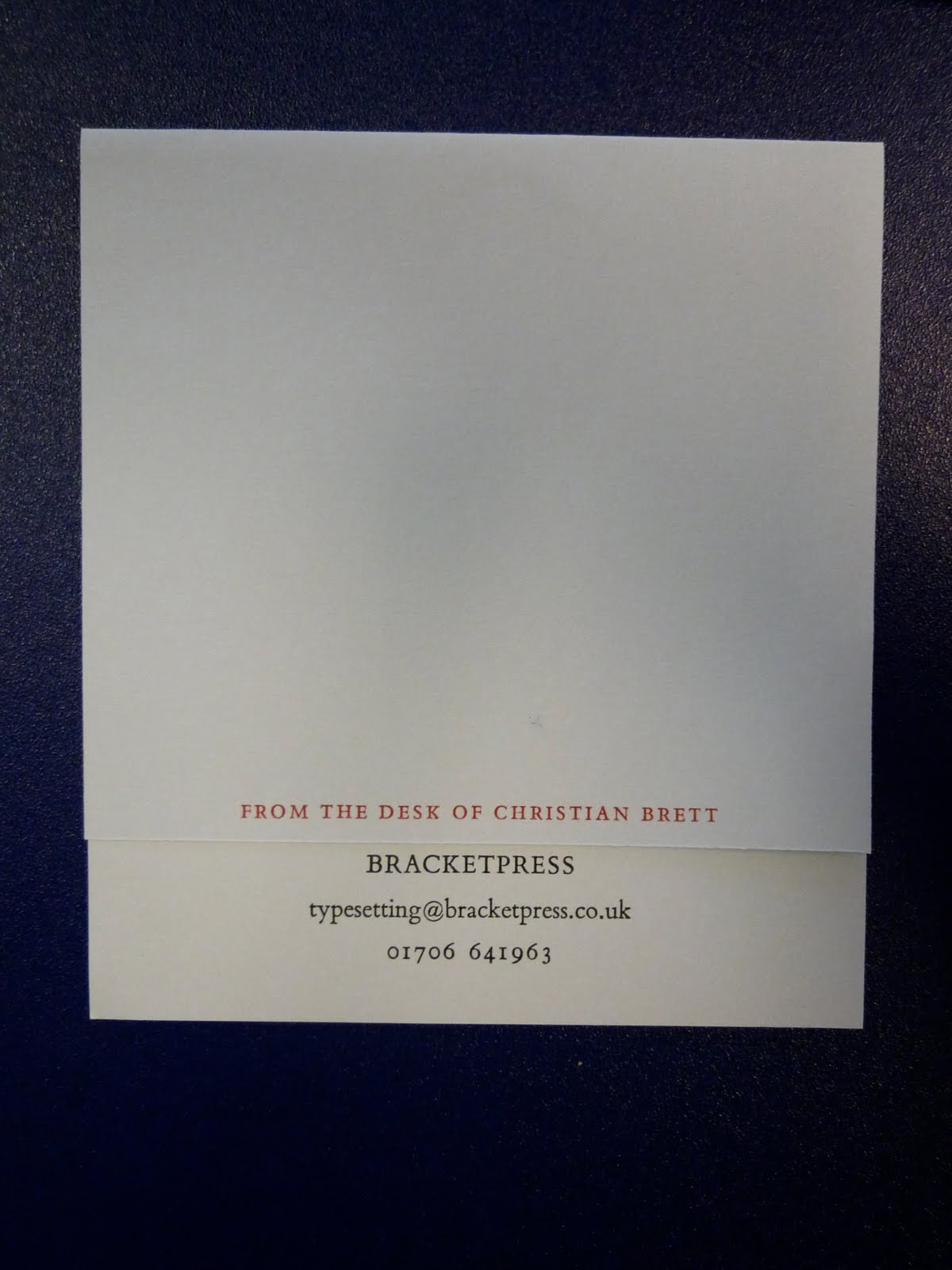
[210mm x 148mm, pp. 18, card cover with tissue wrapper]. Edition of 50
I recently purchased a beautiful item from 'Bracketpress' – and edition of 50 by Alice Smith, which contains a series of visceral explorations, named, Tissues & Bones. The booklet contains full bleed illustrations, with a card cover, aptly encased in tissue and secured with a silver/grey ribbon. I also got sent a compliments card 'from the desk of Christian Brett', which I thought was a great touch.
Inspiring!
Here is issue 9.


Tuesday, 7 December 2010
Avant-Yard, Le Restaurant Surréaliste
Eventually it became appropriate to introduce image alongside typography for the restaurant. I will probably develop this project further in the future to expand it to a 'space' to create an all encompassing experience.
But for now, as I said near the beginning of the project,
Surrealism is said to be the 'total liberation of the mind.' In terms of the typographic restaurant brief I thought about how the actual act of choosing something on a menu is taxing on the mind and is definitely not liberating. What if a menu didn't list endless dishes and side orders, extras, specials, appetisers etc, but rather provoked a feeling or thought.
So here is my 'Menu of Thoughts'


Identity of Restaurant

Wallpaper Sample (from a collection)


Escher Alphabet
 I have been looking at the impossible drawings of M. C. Escher in relation to a typographic restaurant brief I have been completing. I found this interpretation of his work in regards to a typeface in which each letter reflects a different Escher masterpiece
Monday, 22 November 2010
Preliminary Thoughts on a Surrealist Menu.
I like the idea of written thoughts and scribbles, rough sketches and expressions on a page, being taken into 'formal' typography. Expressive typography that really lives and breathes what is being written. (see pics)
Surrealism is said to be the 'total liberation of the mind.' In terms of the typographic restaurant brief thought about how the actual act of choosing something on a menu is taxing on the mind and is definitely not liberating.
What if a menu didn't list endless dishes and side orders, extras, specials, appetisers etc, but rather provoked a feeling or thought. A menu could be descriptive of the sensory experience of eating/drinking, and by simply reading or reciting the menu, would be sufficient in providing the sensory experience. Does a surreal restaurant have food?or is the food in the mind of the consumer? Is it fair to say you could be full if you imagined you were full?Does imagining eating and going through the sensory experience replicate actually doing it, or perhaps enhances it? What if the menu was instructional, a script perhaps? the guest would be instructed to read from the menu and whatever they said would be what the received on a 'plate' (or not as the case may be).
 Richard Hamilton, typographical represention of Marcel Duchamp's 'The Green Box"

Robert Brownjohn, instructional poem on NYC
Sunday, 21 November 2010
Bracketpress, MMU Special Collections,
These Beautiful print and paper examples were displayed at an exhibition in MMU Library. A Sensitive approach to image and typography typography, Featured artists: Penny Rimbaud, Alice Smith, Christian Brett, (BracketPress) and more. This exhibition was when I first came across the work of Alice Smith and Christian Brett, who form Bracketpress. I absolutely loved the work, which I saw and thought how fantastic it would be to visit 'Bracketpress' and see the behind the scenes workings of such work.
Little did I know that getting in touch with Alice Smith for my dissertation that this would lead to me working with Alice on a collaborative project for The Idler. The project began as one illustration and has now spiraled into a fantastically exciting project, for which we now have 17 pages between us in The Idler. The plan is to create a limited edition pamphlet, which will separately showcase the work we have created along with text, which is yet to be confirmed. This is so exciting and after having the inkling of wanting to work with Bracketpress I will now have my very own Pamphlet being sold on the Bracketpress website and at The Idler Academy, Notting Hill, London. So far it has been a pleasure working with Alice and Christian and I have learnt so much and The Idler is close to being sent to print!


Gastrotypographicassemblage.
In 1965 Lou Dorfsman and Frank Stanton stood contemplating the black wall of the blank wall of the new CBS cafeteria. The mundane design proposals submitted for the wall fell below their expectations, and they were determined to find a more original concept...


Exhibition catalogue from exhibition.

CBS feature from U&LC
Monday, 11 October 2010
Wednesday, 6 October 2010


Tuesday, 28 September 2010
Arthouse
 Werner Herzog, 1974.
A man is locked away for his whole life, when he is mysteriously set free he must face the outside world but finds himself trapped in his own sheltered mind. Can his quest for knowledge can grant his freedom? or is he better off without the influences of fellow mankind.
 F.W. Murnau, 1922.
 F.W. Murnau, 1922.
When Count Orlok follows, estate agent, Thomas Hutter to the ficticious German city of Wisborg, it is not just property he is interested in. Orlok unleashes a plague on the city and a series of mysterious deaths occur. All that can stop the 'phantom der nacht' is if a pure-hearted woman (Ellen, Hutter's wife) distracts him from the rooster's call. Once he is dead, however, are her troubles over?
 1987
1987
 1987
1987The city of Berlin is overlooked by guardian angels, these live in a world of black and white and try to ease the pain and suffering of those living. When one angel falls in love with a living woman, he seeks to become mortal and finds he is not alone.
 1920, Robert Weine
 1920, Robert Weine
You must become Caligari.Dr. Caligari's somnambulist, Cesare, and his deadly predictions.
Wednesday, 18 August 2010
Flux Placement
In May of this year, I was lucky enough to be offered a four week placement with John Walsh, Creative Director of Flux Magazine. After being absolutely thrilled by this news I found the experience a huge learning curve and really felt like I got a sense of how a magazine works and how much work goes on beyond the actual page layout. Gemma Snelling and I got one of our illustrations published in the magazine and it is such a great feeling to your work in print and know that thousands of people may see it. It was very interesting researching the history of the magazine, and seeing how far it had come.I found it very inspirational to work with John and acquired a lot of contextual references, which I will use in my future work. For now though here are a few examples of pages I contributed to within the magazine. Enjoy!


 Artwork: Nina McNamara & Gemma Snelling


Subscribe to:
Comments (Atom)

