Tuesday, 1 December 2009
Wednesday, 25 November 2009
Heroin; The Velvet Underground.
 I began looking at Aspen magazine, a 3D multimedia magazine in a box. I found that issue 3 was designed and edited by Warhol and David Dalton.
There appeared peices of art from the cultural gamut ( Litchenstein, Jasper Johns, DeKooning etc) aswell as quotes, ranting, ravings and various contributions from The Velvet Underground themselves....this became a priceless resource during the project and helped me gain a deeper understanding of the band. Credit where credits due, this website has managed to salvage the components from each issue and amazingly preserved them on this website.
http://www.ubu.com/aspen/intro.html
During the project I was amidst a moving image workshop, therefore a natural progression within my research was to look a Andy Warhol films... (torture a cliche), but I felt his presence and influence on the Velvet Underground could not be ignored. I found myself not looking at Warhol in the conventional 'mainstream' pop artist he is so often perceived as, but as an individual of his time, who had much influence on many people, and above all was authentic, which I admired.
Some of the films I looked at;
Beauty Number 2
http://www.youtube.com/watch?v=sF5O7YXUJfU
Andy Warhol Eats Hamburger.
http://www.youtube.com/watch?v=jaf6zF-FJBk
Through Aspen, I also began looking at Dada cinema, in particular Hans Richter, as he had appeared within a later edition of the magazine, when a film reel of 'Rhythm 21' was included within the box...
http://www.youtube.com/watch?v=QEgULqLn5iU
To summarise, I knew I somehow wanted to use the idea of 'bad cinema'; distortion, purposely out of focus, maybe black and white film, but ultimately experiment with processes to see if any suitable outcome came through, initially I wasn't concerned with fitting the work to the song, that would come later.
A Two fork road.
Like I said 'process' was my first point of call, so I began simply with a sketchbook page, which displayed the song lyrics and proceeded something like this;
Process-photocopy-enlarge-repeat-photocopy-enlarge-repeat until page is all black or all white- photograph-contact sheet- shred- tape together shreds- put through reel to reel tape player- photograph-print-photocopy-enlarge-repeat- wet in bath- dry- make collages.....create animation; (video displayed at foot of page)
Second Road; after various tutorials, I decided the idea of processes alone, was not ambitious enough, so as well as carrying on with that I decided to take a completely new approach to the idea of mapping. I decided that after listening to the song, that the words I , I'm, I'll are mentioned at moments of particular intensity, I decided to highlight these words in each verse. I then counted the words between each I, I'm, I'll etc, and noted this down.
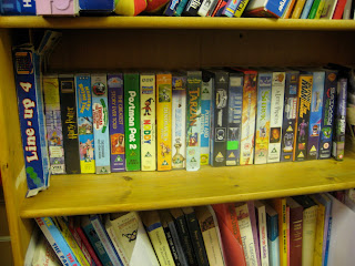
I have always loved the idea of found images, and for this project I thought it would be interesting to perhaps experiement with 'found' video/film. This brought me to a charity shop back home, which was rich with a vast video collection, at a budget price... and lucky for me it was 3 for 2.
I decided that the number of words between each I, I'll or I'm, should correlate to the positioning of the videos on the shelf. (i.e) 'I...3 words later ...I'll' would mean 'First video...three videos later pick another video) This would give me some structure, but also a completely unexpected outcome, as I could never predict which videos would be where. Here is the original shelf format, red dots represent videos I chose. Below is also the final videos with numbers which represent words between I, I'll or I'm.


 Once I had all the videos, I counted the seconds between each I, I'm or I'll and this determined the length of each clip. The results were interesting as once second there would be Postman Pat and the next a war film. The whole video was the length of the song, plus a few more seconds, due to the interval between each verse, in total around 8 mins.
(In order of appearance)
The Story Keepers A.D 64: Sink or Swim/ Roar In The Night. ©1996
The greatest Story Ever Told. ©1965
Nursery Rhyme Time; 60 Favourite Children's Nursery Rhymes. ©1995
Noddy and the Naughty Tail. ©1992
We're Back; A Dinosaur's Story. ©1993
Thomas The Tank Engine & Friends. ©1991
Ice Age © 2002.
Postman Pat 2 ©1986
Showdown in Little Tokyo ©1991
Dirty Rotten Scoundrels © 1988
The Green Berets © 1968
Babylon 5 Volume 31 ©1996
Mighty Morphin Power Rangers; Classic Ranger edition © BVS International
Inspector Morse; Episode 2; The Silent World of Nicholas Quinn © 2003
Cyborg and Blood Sport starring Jean Claude Van Damme © 1987
Tarzan © Disney and Burroughs.
Harry Potter and The Sorcerer's Stone © unknown
Shrek © 2001
Edward Scissorhands © 1990.
-------------------------------------------------
(Andy Warhol Eats Hamburger)
Beauty No. 2- Andy Warhol
Hans Richter- Rhythm 21
Andy Warhol Documentary.
Things I Learned During the project
Monday, 23 November 2009
Tuesday, 17 November 2009
It Felt Like A Kiss Intro
Credit: Adam Curtis. Damon Albarn, Punchdrunk,
http://www.youtube.com/watch?v=2tOYYztbLZo
Watch the intro, and if you can try and see the London Show.

See original Blog Post; http://nina-mcnamara.blogspot.com/2009/08/it-felt-like-kiss.html
Saturday, 14 November 2009
Nice Animation from Digital Kitchen.
took a look back at the year 2067, when man learned how to re-channel energy from natural disasters plaguing the earth.
Tuesday, 10 November 2009
Snappy.
 -Jeremy Deller, Turner Prize Winner, 2004.
When Designers are asked the thought process behind their work, especially when put on the spot, many people, (including myself) can embark on a laborious monologue. During which, most listeners switch off and don't grasp the idea behind the work, rendering the critique pointless and boring. SO to make sure I was keeping on track and to simply explain my thought process I decided to summarise the most important/relevant connections I have made so far.(See Map Below)
 -Mind Map NM
Friday, 6 November 2009
What is Pop Art...?
 BLACK MAP - Jasper Johns.
'I just made it like I make things. I really have nothing to say about it.'
— Johns
Often I ask the question of whether 'art critics' make art famous ( from Ruskin and the romantics to Grafik magazine today) rather than the artist themselves...It is clear that artists who become timeless are talented. right? or is that just what we have been told.
This example of 'Black Map' by Jasper Johns, is undoubtedly open to interpretation, Johns quotes; ' I just made it like I make things, I really have nothing to say about it.' This could be a deliberate act of ambiguity, or is it that the work really does have no meaning, and it's just kind of what he felt like doing at a particular time.
Here is a 'critical explanation' of the work
| "Johns is one of the founders of the Pop Art movement. The term is loosely and often inaccurately applied in our urgency to understand by classifying, but the use of so commonplace a subject as a map emphasizes the popular image involved. The map, 44 inches high by 70 inches wide, is executed as a charcoal drawing except for the southeastern states that are done in black oils. It is necessary to look sharply to make out the names of these southern states. They seem condemned to anonymity as if their names were unspeakable.
The names of the other states are clearly identified, but executed in a variety of lettering styles that are different in size, form, placement, and shading, a characteristic of Johns' treatment of letters and numbers.
In the West, the faint form of a hand is seen, as though California has been touched by a divine hand — or perhaps a commentary on those who think this is so.
The drawing area is sensitively shaded and textured with painterly strokes that often seem calligraphic. In addition to the calligraphic effect, an Oriental feeling is created by Johns' use of variation in the shades of black reminiscent of the Sumi ink painters of China and Japan, who recognize eight distinct shades of black. This master artist has created a work of intense interest."
|
After reading this, does that change our perception of the work, definately yes; from a canvas, which is ambiguous, to a clearer, more digestable piece of 'art'. BUT does this make us like the work more, or did we prefer not knowing..?
I reference this in terms of my own work, often a very simple and basic idea can generate intriguing and 'visually interesting results' and the power of ambiguity should not be overlooked. For example, I recently took part in a one day project where in a group I had to create a 'MAP' of various data.
This is a replica of our response;
Replica of 'Map'
When described as a 'map' this image is intriguing, but once you explain the concept behind the 'map'...does the loss of ambiguity create a loss of intrigue.?
The task of 'mapping' was based around 7 songs, and each group (total 14 including ourselves) had to guess which of our tutors chose which song. In the original you now can see a horizontal line going through the centre of the image, with numbers + and - above and below the line representing right and wrong answers, and the scale from left to right being worst-best. the vertical line in the centre represents our group.
Here is a replica of the original;
When we had to present out work to the rest of the year, I found that once the work was explained and people knew how it was done...they no longer liked it, the idea not being overly witty or clever, changed their perception of the work.
I felt that not everything must always be explained, much to my tutors distaste. I understand the importance of a great idea behind something... but sometimes it would be nice to keep that idea to ourselves and just enjoy the work without explanation. After all, when people see our work in everyday life, we're not always going to be there to explain it to them. The work must speak for itself.
NM.
Thursday, 5 November 2009
Aspen.
 1. "...Writing was dead, movies were dead. Everybody sat like an unpeeled orange. But the music was so beautiful."
Wednesday, 4 November 2009
Ecoute.
A retrospective of my exploration of 'Sound/Communication' and 'Mapping' sometimes a combination of both. Just a reminder to expand, evolve and avoid repeating myself.

Sachsenhausen Remembered.
New Blog Entry;http://nina-mcnamara.blogspot.com/2009/09/is-not-for-apple-z-is-not-for-zebra.html

Trapping Sound
Original Blog entry;http://nina-mcnamara.blogspot.com/2009/08/re-communicate.html

made speechless by own speech
Original Blog Entry; http://nina-mcnamara.blogspot.com/2009/08/stitch-it.html

Map of my body.
Original Blog Entry;http://nina-mcnamara.blogspot.com/2009/09/me-in-words.html

Stitched Communication
Original Blog Entry;http://nina-mcnamara.blogspot.com/2009/08/stitched-communication.html

Braille VHS.
Original Blog Entry;http://nina-mcnamara.blogspot.com/2008/03/braille-vhs.html

A sound map of 'The School of Art'
Original Blog entry;http://nina-mcnamara.blogspot.com/2009/08/mapping-with-sound.html
...and here a couple of videos...
Wednesday, 28 October 2009
Potential song choices for Workshop project...
 Dodie Stevens; Pink Shoe Laces
http://www.youtube.com/watch?v=-gFOzaSQY6Q
Easier Said Than Done; The Essex.
http://www.youtube.com/watch?v=GIHaTefZ3aM
I am thinking of animating 'The Good Wife Guide' therefore these songs have been chosen for my workshop...
Tuesday, 27 October 2009
Name that Tutor...?

Sunday, 25 October 2009
A Journey Of Intrigue...
So with the restriction of one typeface; Helvetica Bold, and a limited colour palette I had to decide how to use one very complex, intriguing and beautiful item (see below), and take it's elements to create a relevant layout response.
With so much to work with and so many idea routes to choose from, difficult times lay ahead.. here is a photographic journey (and some words) of how I got from start to finish in three very short (...but sometimes long) weeks.
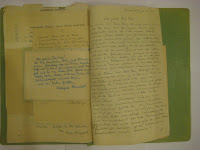
I found this file in Berlin, from 1952 containing letters to a 'Mr Herbert Ossa' in response to a personals ad in Germany (copy all in German)
From these studies I took the idea of obstruction and revelation, (as seen with the turn of each page) as a basis for my layouts and to create intrigue.


The Imagery.
I Developed slides from 1953, also found in Berlin. I wanted to crop, reveal and obstruct specific sections of the image to reflect what was being said in the copy.


(a selection from about 20)
The Copy.
So with the help of Kirsitna Voll(BA (Hons) Design and Art Direction), I overcame one of the largest obstacles within the project. I needed to find out the meaning of the copy... the fiel contained very complicated and intricate handwriting, which had to be painstakingly copied out and transformed to Helvetica...once I knew a basic idea of meaning.. I could then write the copy correctly ( I Hope).


(500 words)
The layout.
I initially used handmade layouts to create a sense of intrigue, I then dropped these into InDesign so I could compose my layouts. I felt playing with composition in this way was much more effective than going straight into InDesign..by experimenting with a number of different page combinations,this allowed me to create a vast number of trials before beginning a final layout.


The final 4.
So here are the final outcomes chosen from 16 InDesign layouts.( I will give a brief caption to explain the narrative in the copy...but try not to take away the 'intrigue'


Introduction of male/female relationship


Romantic element/location


introduction of second female figure (emphasis on women (junger dame)


Separation of two characters...not all stories have a happy ending.


