 http://www.bbc.co.uk/iplayer/episode/b00nf10k/Krautrock_The_Rebirth_of_Germany/
Wednesday, 28 October 2009
Potential song choices for Workshop project...
 Dodie Stevens; Pink Shoe Laces
http://www.youtube.com/watch?v=-gFOzaSQY6Q
Easier Said Than Done; The Essex.
http://www.youtube.com/watch?v=GIHaTefZ3aM
I am thinking of animating 'The Good Wife Guide' therefore these songs have been chosen for my workshop...
Tuesday, 27 October 2009
Name that Tutor...?

My guesses of who chose each of the songs for the new brief...?
Assuming the six tutors are;
Hitch,
Liz,
Sue,
Mack,
Graham.
John.
Heroin- The Velvet Underground - Hitch
Being for the benefit of Mr.Kite - The Beatles - Mack
Superstition- Stevie Wonder - Liz
O Superman - Laurie Anderson - John Walsh
Rose Rouge- St. Germain - Graham.
Frontier Psychiatrist- The Avalanches - Sue
VERY unsure... feel pretty sure about Liz, Sue, John, Hitch....not so sure about graham/mack..
Sunday, 25 October 2009
A Journey Of Intrigue...
Restriction.
So with the restriction of one typeface; Helvetica Bold, and a limited colour palette I had to decide how to use one very complex, intriguing and beautiful item (see below), and take it's elements to create a relevant layout response.
With so much to work with and so many idea routes to choose from, difficult times lay ahead.. here is a photographic journey (and some words) of how I got from start to finish in three very short (...but sometimes long) weeks.
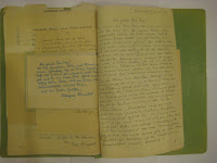
I found this file in Berlin, from 1952 containing letters to a 'Mr Herbert Ossa' in response to a personals ad in Germany (copy all in German)
From these studies I took the idea of obstruction and revelation, (as seen with the turn of each page) as a basis for my layouts and to create intrigue.


The Imagery.
I Developed slides from 1953, also found in Berlin. I wanted to crop, reveal and obstruct specific sections of the image to reflect what was being said in the copy.


(a selection from about 20)
The Copy.
So with the help of Kirsitna Voll(BA (Hons) Design and Art Direction), I overcame one of the largest obstacles within the project. I needed to find out the meaning of the copy... the fiel contained very complicated and intricate handwriting, which had to be painstakingly copied out and transformed to Helvetica...once I knew a basic idea of meaning.. I could then write the copy correctly ( I Hope).

(500 words)
The layout.
I initially used handmade layouts to create a sense of intrigue, I then dropped these into InDesign so I could compose my layouts. I felt playing with composition in this way was much more effective than going straight into InDesign..by experimenting with a number of different page combinations,this allowed me to create a vast number of trials before beginning a final layout.


The final 4.
So here are the final outcomes chosen from 16 InDesign layouts.( I will give a brief caption to explain the narrative in the copy...but try not to take away the 'intrigue'


Introduction of male/female relationship

Romantic element/location


introduction of second female figure (emphasis on women (junger dame)


Separation of two characters...not all stories have a happy ending.
So with the restriction of one typeface; Helvetica Bold, and a limited colour palette I had to decide how to use one very complex, intriguing and beautiful item (see below), and take it's elements to create a relevant layout response.
With so much to work with and so many idea routes to choose from, difficult times lay ahead.. here is a photographic journey (and some words) of how I got from start to finish in three very short (...but sometimes long) weeks.
I found this file in Berlin, from 1952 containing letters to a 'Mr Herbert Ossa' in response to a personals ad in Germany (copy all in German)
From these studies I took the idea of obstruction and revelation, (as seen with the turn of each page) as a basis for my layouts and to create intrigue.


The Imagery.
I Developed slides from 1953, also found in Berlin. I wanted to crop, reveal and obstruct specific sections of the image to reflect what was being said in the copy.


(a selection from about 20)
The Copy.
So with the help of Kirsitna Voll(BA (Hons) Design and Art Direction), I overcame one of the largest obstacles within the project. I needed to find out the meaning of the copy... the fiel contained very complicated and intricate handwriting, which had to be painstakingly copied out and transformed to Helvetica...once I knew a basic idea of meaning.. I could then write the copy correctly ( I Hope).


(500 words)
The layout.
I initially used handmade layouts to create a sense of intrigue, I then dropped these into InDesign so I could compose my layouts. I felt playing with composition in this way was much more effective than going straight into InDesign..by experimenting with a number of different page combinations,this allowed me to create a vast number of trials before beginning a final layout.


The final 4.
So here are the final outcomes chosen from 16 InDesign layouts.( I will give a brief caption to explain the narrative in the copy...but try not to take away the 'intrigue'


Introduction of male/female relationship


Romantic element/location


introduction of second female figure (emphasis on women (junger dame)


Separation of two characters...not all stories have a happy ending.
Saturday, 17 October 2009
True Blood Title Sequence

Amazing True Blood Title Srquence.
Some info about the title sequence by 'Digital Kitchen';
'True Blood's Emmy-nominated title sequence was created by Digital Kitchen, a production studio that was also responsible for creating the title sequence of Six Feet Under. The sequence, which is primarily composed of portrayals of the show's deep South setting, is played to "Bad Things" by Jace Everett.
Digital Kitchen wished to explore themes of redemption and forgiveness in the opening title sequence.
Conceptually, Digital Kitchen elected to construct the sequence around the idea of "the whore in the house of prayer" by intermingling contradictory images of sex, violence and religion and displaying them from the point of view of "a supernatural, predatory creature observing human beings from the shadows ..." Digital Kitchen also wished to explore ideas of redemption and forgiveness, and thus arranged for the sequence to progress from morning to night and to culminate in a baptism.
Most of the footage used in the sequence was filmed on location by Digital Kitchen. Crew members took a four-day trip to Louisiana to film and also shot at a Chicago church and on a stage and in a bar in Seattle. Additionally, several Digital Kitchen crew members made cameo appearances in the sequence.
In editing the opening, Digital Kitchen wanted to express how "religious fanaticism" and "sexual energy" could corrupt humans and make them animalistic. Accordingly, several frames of some shots were cut to give movements a jittery feel, while other shots were simply played back very slowly. Individual frames were also splattered with drops of blood. The sequence's transitions were constructed differently, though; they were made with a Polaroid transfer technique. The last frame of one shot and the first frame of another were taken as a single Polaroid photo, which was then divided between emulsion and backing. The emulsion was then filmed being further separated by chemicals and those shots of this separation were placed back into the final edit.
Eight different typefaces, inspired by Southern road signage, were also created manually by Camm Rowland for cast and crew credits, as well as the show's title card.'
Here is the title sequence below;
Go on the website and see the 'Case Study' for the making of the sequence/Website;

Thursday, 15 October 2009
Audrey Niffenegger Signing.


 Artist and author of bestselling book 'The Time Traveler's Wife, ' Audrey Niffenegger, promotes her new book 'Her Fearful Symmetry' at Waterstones, Deansgate. The talk begins with a chapter reading from the new book and then a question and answer session. Niffenegger appears with red hair and round glasses, and greets small crowd. Niffenegger struck me as witty, extremely intelligent and a self-named non realist.In an American accent and no mic, her first words are "Wow, when I came into this room earlier it seemed so huge, and now it's filled with people its like we're all sitting in eachother's laps...so maybe we'll try that later" Questions about 'The Time Traveler's wife' were put to Niffenegger more frequently than the new book, but she was happy to answer them all...I won't go into the answers ,as for anyone who hasn;t read the book, these will appear very confusing..My adice- Read the book, it WILL change your life.
 As an artist she began making prints in 1978 under the tutelage of William Wimmer. Miss Niffenegger trained as a visual artist at the School of the Art Institute of Chicago, and received her MFA from Northwestern University’s Department of Art Theory and Practice in 1991. She has exhibited her artist’s books, prints, paintings, drawings and comics at Printworks Gallery in Chicago since 1987.
Her first books were printed and bound by hand in editions of ten. Two of these have since been commercially published by Harry N. Abrams: The Adventuress and The Three Incestuous Sisters.
Wednesday, 7 October 2009
The Corinthians;A Kodachrome Slideshow.


 "Kodachrome has gone and with it the colour palette of the mid-20th century. The clacking carousel slideshows that so brightly projected our earliest memories have made way for a new age of digital photography. But in The Corinthians, a photo book by Ed Jones and Timothy Prus, more than 200 Kodachrome photographs have been brought together as a lasting reminder of the film stock of the last century."
I saw this book and found it...'intriguing'..potential source for new project..
"Kodachrome has gone and with it the colour palette of the mid-20th century. The clacking carousel slideshows that so brightly projected our earliest memories have made way for a new age of digital photography. But in The Corinthians, a photo book by Ed Jones and Timothy Prus, more than 200 Kodachrome photographs have been brought together as a lasting reminder of the film stock of the last century."
I saw this book and found it...'intriguing'..potential source for new project..
Monday, 5 October 2009
Restriction/Shadow/Belief.

 Restriction, Belief, Shadow.
Initially we decided to take the two elements from the three we were given, which best related to each other; belief (man jumping from a building) and Shadow (a quote from Buddha)
We decided on the main themes of the quote were
• Good vs. evil
• Karma, so what you do/think reflects your fortune.
• Happiness Vs Sadness.
We decided the main themes of the image were:
• A Leap of faith
• Decisions
• The visual representation of falling.
We had to take aspects from each element and incorporate it into one piece. After much deliberation we decided the presence of image was unnecessary. We could represent the idea of leaping/falling, and incorporate good/bad choices within this.
The final outcome:
• Evil- A catastrophe of letters and words, representing a bad/evil choice, will lead to pain and suffering..hence the letters crashing to the ground....resulting in a painful/fatal landing.
• Pure/good- the words and letters are gliding down towards a soft and happy landing. Colour is used to highlight good VS evil.
(Group project; Nina McNamara, John McPartland, Sarah McCreedy.)
Restriction, Belief, Shadow.
Initially we decided to take the two elements from the three we were given, which best related to each other; belief (man jumping from a building) and Shadow (a quote from Buddha)
We decided on the main themes of the quote were
• Good vs. evil
• Karma, so what you do/think reflects your fortune.
• Happiness Vs Sadness.
We decided the main themes of the image were:
• A Leap of faith
• Decisions
• The visual representation of falling.
We had to take aspects from each element and incorporate it into one piece. After much deliberation we decided the presence of image was unnecessary. We could represent the idea of leaping/falling, and incorporate good/bad choices within this.
The final outcome:
• Evil- A catastrophe of letters and words, representing a bad/evil choice, will lead to pain and suffering..hence the letters crashing to the ground....resulting in a painful/fatal landing.
• Pure/good- the words and letters are gliding down towards a soft and happy landing. Colour is used to highlight good VS evil.
(Group project; Nina McNamara, John McPartland, Sarah McCreedy.)
Subscribe to:
Comments (Atom)

