
Showing posts with label Exhibition Space. Show all posts
Showing posts with label Exhibition Space. Show all posts
Friday, 17 February 2012
Recorders Down Under

Wednesday, 14 December 2011
The Mad Square
Modernity in German Art 1910 – 37
National Gallery of Victoria
“Experimental, provocative and utterly compelling...”
Two of my earliest memories of graphic inspirations were László Moholy-Nagy and El Lissitzky and since then Constructivism and later Modernity have been of huge inspiration throughout my career. On discovering NGV latest exhibition entitled “The Mad Square” (Der Tolle Platz), it was a pre-requisite for me to attend. The exhibition name derives from Felix Nussbaum's 1932 painting of Berlin's famous Pariser Platz. 'Tolle' translates to mean both 'mad' and 'fantastic.' which is certainly a common thread, running through the exhibition. The 'square' is approached as a physical space, with representations of the city, as well as a state of turbulence and unrest, which characterises the era.
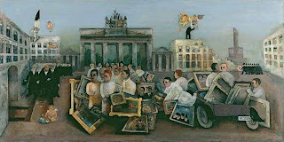

Felix Nussbaum, Der Tolle Platz, 1932
Aptly the exhibition begins with a screen excerpt of “Das Cabinet Der Dr. Caligari,” which is the story of deadly sonambulist, Cesare, approaching mental illness in a way which forces the viewer to be sucked in and an example of early German Expressionist cinema.
My recently completed university dissertation follows themes of unrest in Weimar Germany, in relation to artists such as Hannah Höch and Marianne Brandt, both of whom feature in the exhibition. A time of turmoil within Germany inspired incredible 'avant-garde' art movements; Expressionism, Dada, Constructivism, Bauhaus and New Objectivity. It was really inspiring to me to see so many points of cultural and contextual reference grouped together in one exhibition, and especially considering their relevance and importance to my own creative development. For me the exhibition combined both artistic, graphic, physical and filmic examples of a whole spectrum of inspiration and as I followed the prominent jagged red arrow around the space I was never disappointed by what was around the next corner.


El Lissitzky, Beat the Whites with the Red Wedge, 1919
László Moholy-Nagy

Aritists featured in the exhibition include: Max Beckmann, Otto Dix, George Grosz, Christian Schad, Hannha Hoch, August Sander, Laslo Moholy Nagy, El Lissitsky
Website
Website
Saturday, 30 July 2011
Surrealism: The Poetry Of Dreams, Brisbane
SURREALISM AND CONTEMPORARY ART
23 JULY 2011
DR. MIRANDA WALLACE. (Curational manager of international art and exhibitions research)

I decided to visit Brisbane's recent major Surrealist exhibition at the Gallery of Modern Art. I was lucky enough to also catch a lecture with Dr. Miranda Wallace, the curatorial manager of the exhibition, in discussion about the relationship between the Surrealist movement and contemporary art, which enhanced my visit to the exhibition.
When asked what she liked most about Surrealism, Wallace said she finds it first of all difficult to pin down what Surrealism is, but that largely her favourite aspect is the photography and the clear influence of cinema on many surrealist photographers, including contemporary artists. It is clear that Wallace wanted emphasise this link within the exhibition as film projections consistently appear alongside static works within the exhibition. There is also a surrealist cinema season devoted to moving image, (The Savage Eye; Surrealism and Cinema) which is running alongside the exhibit.
Wallace continues that one reason why it is so hard to define Surrealism is that many works are not linked by a visual style or approach but rather it is more a 'mode of enquiry.' Surrealism sets out to approach the more challenging aspects of life; the subconscious, The invisible realm and other 'hard to access' places, in fact Surrealists were obsessed by these themes. When we consider this, it makes sense and that there isn't one all encompassing style, as if there were, there would be some suggestion that each individual's subconscious is not unique. This is not to say that there are not common themes between artists and links between certain symbolic aspects of work as well and artistic approaches, however each outcome is essentially personal to artist.
In regards to contemporary art or in fact contemporary culture, Wallace explored the fact that Surrealism has also been one of the largest influences in commercial advertising; this bringing together of random things, is a technique, which at one stage became hugely useful within advertising.
Wallace then began to talk us through a collection of slides' some from the exhibition and some contemporary examples.
SLIDES
Victor Bauner 1934 – artificial man,

This first slide displayed a hybrid creature, displaying this idea of part human part machine. Surrealists were consistently concerned with the line between the real and unreal to perhaps create a stronger more capable human being, forever trying to cross this boundary. In the example shown, the real and the unreal are merged. An idea, which became possible after WWI when the production of prosthetic limbs rose and these hybrids appeared, bringing us closer to this surrealist vision of the unreal becoming real. Wallace made the link to The Tales of Hoffman; where a man falls in love with a mannequin; falling in love with something unreal is perhaps the ultimate bringing together of real/unreal.
Wallace touched on a lot of important things and appeared to have absolutely vast knowledge, especially in terms of Surrealism's relevance to contemporary art, theatre, literature, culture, history etc. This fascination with the body perhaps stemmed from Breton and Ernst's medical background, both trained to be doctors, until they resigned to become poets, yet their fascination with the body continued as they searched to link artificial worlds.

Ron Mueck, mask 11, 2011
contemporary example of the real and the unreal joined together
-the fantastic world
Perhaps the difference between then and now is that contemporary surrealists there is an element of humour and a replication of the movements attitudes, whereas surrealists of the time were completing a genuine search for truth, a genuine way to tap into the subconscious and make the unreal, real.
Wallace showed a slide of Bretons 1960s studio/home, which was fascinating and of which a video appears in the exhibitions, the studio is permanently displayed at the Centre Pompidou, Paris. Within the studio many esoteric objects appear. Breton had a strong belief in the power, status and mythology of objects, hence his vast an eclectic collection.
Often the question is asked 'When does the object become art? Is it when the artist pronounces it art, as if the artist somehow has a divine power. In the case of Surrealism the answer is no, an object must hold some magical power, or retain a sense of meaning or worth, never be a commodity or mass produced consumer item, perhaps found or manipulated in some way. The fall in popularity of Surrealism is largely to do with the rise of Pop Art, which was doing precisely this taking and everyday consumer object and displaying an oversized, over spruced, shiny version of it and calling it art, essentially going against everything that Surrealism was about. Refusing to commit to convention.
The exhibition itself was curated in chronological order, mapping the rise and 'fall' of Surrelaism.
“Transform the world' said Marx, 'Change Life' said Rimbaud. These two orders are for us one and the same” - Bréton 1955
"Every product of disgust is capable of becoming a negation of the family is Dada: a protest with the fists of its whole being engaged in destructive action dada: the knowledge of all the means rejected up until now by the stonefaced sex of comfortable compromise and good manners, dada: absolution of logic: which is the dance of those impotent to create: dada of every social hierarchy and equation set up for the sake of values by our valets Dada absolution of memory: dada – abolition of archaology” Dad absolution of prophets Dada: absolution of the future absolute and unquestionable faith in every God that is faith in the immediate product of spontaneity."
Tristan Tszara -Dada Manifesto, 1918.
The fall of popularity in Surrealism due to the rise of Pop Art, which essentially went against everything that Surrealist was about, often the question is asked ' when does the object become art? Is it when the artist pronounces it art, as if the artist somehow has a divine power. In the Case of Surrealism the answer is no, an object must hold some magical power, or retain a sense of meaning or worth, never be a commodity or mass produced consumer item, perhaps found, but then manipulated in some way. Pop Art was doing precisely this taking and everyday consumer object and displaying an oversized over spruced shiny version of it and calling it art.
On visiting the exhibition itself after the talk I found some very different works to what I have seen before – the surreal house was more specific, obviously centred around the house and themes of domesticity, of course this is a revisited theme from many surrealist, this show has a broader, general overview of surrealism, with a strong link to cinema in conjunction with the surreal film festival being held at the gallery, there is a clearer narrative, however when listening to the talk it seemed that Dr. Wallace's interviewer was perhaps speaking with little knowledge of Surrealism, which is perhaps effective as it is such a vast and complex subject that many of the audience may only have touched on parts of it. It was reassuring, however, that Wallace clearly had more to offer on the topic.

Belle Du Jour, 1967
Commercial Surrealist Film

Early Hans Richter

Mannequin Love


Friday, 8 April 2011
Angelheaded Hipsters


After a critique about my Beat Generation project, I decided to go back to my research phase and try to learn a little bit more around the background and culture of the Beats, hoping this would inspire me further in the project.
What better way than to visit the Angelheaded Hipsters exhibition at the National Theatre in London. the exhibition was an extensive collection of Allen Ginsberg's photography, amongst others, which mapped out, behind the scenes of archetypal Beat characters such as Jack Kerouac, William Burroughs, Carl Soloman, and Herbert Huncke to name a few. I was surprised at the sheer quantity of photographs and found Ginsberg's annotations of the photographs a great insight. It was intriguing to see Ginsberg's photographs of close friends,David Hockney, Madonna, Patti Smith and Roy Lichtenstein as well as the Beat's huge influence on the likes of Jim Morrison and Bob Dylan.
All images courtesy of Corbis.
Wim Crouwel: A Graphic Odyssey, talk and Exhibition

From right Mels & Wim Crouwel & Rick Poyner, Tony Brook (Spin) on front row.
I took a trip to London to visit the the Design Museum's retrospective of Dutch Typefather, Wim Crouwel. A Graphic Odyssey was accompanied by a talk from the man himself and his architect son, Mels Crouwel. The whole discussion mediated by renowned design critic Rick Poyner.
Curated by Tony brook of Spin, the exhibition is aptly gridded out with long white tables. A huge collection of Crouwel's work adorns the walls. Crouwel's lesser known early exhibition design resides alongside his iconic posters, detailed sketchbook extracts and logo roughs as well as Crouwel's lower case re-design of the phonebook. The exhibition also showed work from contemporary designers who have since been inspired by Crouwel, proving that the Total Design aesthetic remains undated even by todays standards.
After seeing the exhibition I walked upstairs to the intimate lecture space, to watch the talk, which was sold out. There were a limited number of seats, which created a good atmosphere as the talk felt much more like an informal discussion rather than a hard nosed design debate.
On seeing Crouwel I noticed that he had such a presence amongst his many admirers and it was clear that I was in the company of an icon. Mels also white haired an bespectacled, didn't wilt in his fathers presence, but rather embraced it, as he explained he had done all his life. For Mels, a career within design was inevitable, growing up in a converted house boat, surruounded by the designs and creations of his father from furniture to the house structure itself.
I found the discussion lively and upbeat, Poyner certainly knows how to curate a discussion and it was interesting to see that although Mels had been saturated by his fathers design influence and shared his modernist values, when applied to architecture, Mels is certainly a designer in his own right. The idea that graphic design can be applied to the way a space works is not a new idea, but it is certainly one that makes sense, highlighting the ever blurring boundaries between creative disciplines.
I bought the beautifully designed catalogue at the end of the show and if it wasn't for my need to catch an early train I would have definitely hung around to meet the man himself and perhaps get an autograph. Overall an great insight into Modernist Dutch design as well as the influence of Britain (Fletcher Forbes Gill) on the Dutch design scene. A great addition to my ever increasing interest in typography.
I have recorded the talk and it can be listened to here
Sunday, 27 March 2011
Anish Kapoor

There were a surprising number of works within quite a small space, perhaps too many. I could hear the familiar mumblings from fellow visitors questioning the integrity of contemporary art and how could what looked like a few piles of exotic spices be art? Others, especially children who were visiting the exhibition seemed fascinated by what they were seeing and rightly so, each piece definitely stirred up a level of puzzlement and caused me to stop and try to work out what it was I was actually looking. I especially enjoyed the piece named 'When I am Pregnant,' which was a huge white convex mound which seamlessly protruded from the gallery wall, from angle it was quite clearly visible, but looking directly at the wall, the bump was barely visible. I found this piece quite beautiful.
I often like to visit things, which are seemingly irrelevant to my practice because you never know how they might inspire you in the future.

Saturday, 5 March 2011
John Stezaker
 Whitechapel Gallery, London
04/03/2011
John Stezaker is one of the most renowned collage artists of our time and it was a treat to find that a retrospective of his work had been curated for the Whitechapel Gallery. I first came across Stezaker's work when I visited New York in 2007, whilst studying on my foundation year, at the time I was unaware of how influential Stezaker would come to be. I re-visited a sketchbook from New York whilst studying my degree and noticed a small thumbnail of an intriguing and jarring image, researching further I realised it was Stezaker and began to explore his work further.
Within my wider research for my dissertation I researched Stezaker and found some of his themes very interesting. Stezaker uses film stills an juxtaposes them with disparate or complimentary images, film, stills.
Stezaker explores gender roles in cinema and is often described as a male feminist. It is interesting to wonder whether his work is perceived differently because he is male, compared to if a female generated similar work.
He comments on the idea that women are objects of attention and subjects of the male gaze, a theme prominent within Hollywood cinema. Using collage Stezaker subverts, exaggerates and draws attention to our perception, using what we take for granted and offering the opportunity to re-think what we see by rearranging the way images are ordered and presented. This transformation of images allures the viewer, as collage does so often, into a new sense of reality, a continuous comment and questioning of perception.
I researched Stezaker for my dissertation, I found it interesting to observe a male response to some of the feminist issues I had been exploring. To see the huge retrospective of Stezaker's work was inspiring and overwhelming to see so much of his work in one place, the work has much more resonance in the space of a gallery rather than on screen or in a book, seen at the size which Stezaker intended. What was so impressive is that each of the collages were original works, not re-produced or printed out, the actual fragments were original, and there is something endearing about how two disparate, unedited elements can work together in a strange harmonious chaos.
The idea of male dominance/gender hierarchy and the male/female gaze is something I have explored in a film workshop, with Sam Meech using found footage for the North West Film Archive, and something I will continue to explore in future work.
Tuesday, 15 February 2011
Sir Eduardo Paolozzi; General Dynamic F.U.N


General Dynamic F.U.N
Holden Gallery, Manchester.
A New Exhibition at The Holden Gallery, Manchester features 50 photolithographs and screenprints from renowned artist and sculptor, Eduardo Paolozzi. Paolozzi places disparate images next to each other and finds a connection between the two, however tenuous this may be, the treatment and composition of his prints are striking and a social comment on the world of benevolent technology.
"Thermo-nuclear weapons systems and soft drinks commercials co-exist in an overlit realm ruled by advertising and pseudo-events, science and pornography"
I found the prints intriguing and incredibly contemporary, it is clear to see that Paolozzi (b. 1924) has been a great influence to other artist working on the topic of mass media advertising and consumerism or dealing with the diversity of the image. I find that some of the attitudes expressed in his prints are reflective of those discussed in the documentaries of Adam Curtis, a sinister undertone juxtaposed with a certain 'squeaky clean-ness' are present within Paolozzi's prints and Curtis' documentaries.
After the recently attending a lecture by Vaughan Oliver, I find the exhibition especially relevant, regarding Oliver's discussion of the importance and impact of placing two seemingly disparate images together within a graphic design context. The unexpected connection can create a sense of joy, fear, horror, beauty....or a combination of jarring emotions.
I definitely recommend this exhibition to anyone interested in the semiotics of the image and the potential subversion of that.
Friday, 11 February 2011
OWT Exhibition
The work from zines 1-4 has recently been carefully curated into an exhibition, which is currently showing at Cord Bar, Manchester. The opening was held last Thursday, 10th, February. Each piece of work was beautifully framed and is available to purchase. The night was a huge success and upon arriving I couldn't believe the amazing turn out, clearly an immense amount of planning and organisation had gone into the exhibition and it certainly paid off. There were so many great pieces of work to be seen as well as a projected 'zine,' which combined slides brought by guests at the event. The atmosphere was incredible, I had a really great night, so well done to everyone involved and especially the OWT team, also big thanks for featuring my work, can't wait for the next zine, which is incidentally based around the word 'Atmosphere'
You can submit work for the next zine by sending submissions to submit@owtcreative.com
visit the the OWT website here

My submission for OWT 4


Wednesday, 26 January 2011
Faux-tograph
Camera-less Photography
V&A Museum, London.
13th October 2010-20th February 2011
Recently I have become interested in photograms, a type of camera-less photography, which involves placing an object in contact with a light sensitive surface and exposing both to light, the area which the object blocks the light is traced and recorded on the paper.
Considering my recent interest I thought it would be interesting to see the Shadow-Catchers exhibition at the V&A, and interesting it was. I found that there were other types of camera-less photography including; a Luminograms, Chemigrams, Digital C-prints or a Dye Destruction print.
"Images made with a camera imply a documentary role, In contrast, camera- less photographs show what has never really existed. Encountered as fragments, traces, signs memories or dreams - these images leave room for the imagination, transferring the world of objects into a world of visions"
I was particularly interested in Floris Neusüss' work, the sheer scale of the photograms was impressive. He created a sense of movement in a static image, a particular favourite was the image of someone leaning back on a chair named 'Be right back' I really got a sense of the moment the photogram happened.
Neusüss also created an intriguing image, instead of using artificial light from the darkroom he exposed light sensitive paper to a thunder storm and the results came from lightening exposing the paper.


Floris Neusüss
Gary Fabian Miller's work had an extremely sensitive approach and was one of the few works which embraced colour in the show. One piece called Delphinium, showed the process of a single petal being placed directly into the negative tray and exposed onto photographic paper, incredibly delicate.
Other highlights were Adam fuss' smoke diagrams, Susan Derges, Chladni inspired responses to sound and the video documentary, which gave an insight into the lives of the artists and their thoughts on such a 'dark' process.

Susan Derges
"If you don't create. You die. It's just about survival really"
- Adam Fuss
Sunday, 21 November 2010
Bracketpress, MMU Special Collections,
These Beautiful print and paper examples were displayed at an exhibition in MMU Library. A Sensitive approach to image and typography typography, Featured artists: Penny Rimbaud, Alice Smith, Christian Brett, (BracketPress) and more. This exhibition was when I first came across the work of Alice Smith and Christian Brett, who form Bracketpress. I absolutely loved the work, which I saw and thought how fantastic it would be to visit 'Bracketpress' and see the behind the scenes workings of such work.
Little did I know that getting in touch with Alice Smith for my dissertation that this would lead to me working with Alice on a collaborative project for The Idler. The project began as one illustration and has now spiraled into a fantastically exciting project, for which we now have 17 pages between us in The Idler. The plan is to create a limited edition pamphlet, which will separately showcase the work we have created along with text, which is yet to be confirmed. This is so exciting and after having the inkling of wanting to work with Bracketpress I will now have my very own Pamphlet being sold on the Bracketpress website and at The Idler Academy, Notting Hill, London. So far it has been a pleasure working with Alice and Christian and I have learnt so much and The Idler is close to being sent to print!


Recorders
Manchester Art Gallery,
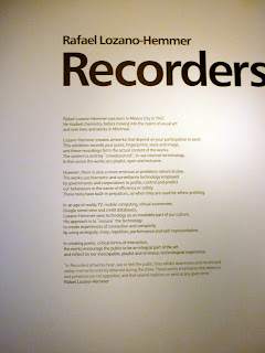


Finally, I have been to see the 'Recorders' exhibition at The Manchester Art Gallery. I thoroughly enjoyed the interactive element of the exhibition, this combined with my obsession with recording devices enhanced the experience. I have officially bookmarked Rafael Lozano-Hemmer.
DR. ME Do Urban Outfitters.
Intrigued by how an exhibition could work in Urban Outfitters, I took the trip to Market St, Manchester to find out. The exhibition was held in between two floors in the corner of the staircase. After deciding I was one of the lesser trendy people there and trying to avoid being filmed on camera and photographed at an unflattering angle (failing), I stood back to admire the work entitled, 'like wat kids do.' I really liked the aesthetic of the work, mixing collage techniques with graphic design. I could relate this style of work with my own, it was nice to see the work in a purely aesthetic context and I would be interested to see how this style of work could be applied to a commercial situation.


Subscribe to:
Posts (Atom)

 Posts
Posts


