Pages

Sunday, 21 November 2010

DR. ME Do Urban Outfitters.

Intrigued by how an exhibition could work in Urban Outfitters, I took the trip to Market St, Manchester to find out. The exhibition was held in between two floors in the corner of the staircase. After deciding I was one of the lesser trendy people there and trying to avoid being filmed on camera and photographed at an unflattering angle (failing), I stood back to admire the work entitled, 'like wat kids do.' I really liked the aesthetic of the work, mixing collage techniques with graphic design. I could relate this style of work with my own, it was nice to see the work in a purely aesthetic context and I would be interested to see how this style of work could be applied to a commercial situation.

Gastrotypographicassemblage.

In 1965 Lou Dorfsman and Frank Stanton stood contemplating the black wall of the blank wall of the new CBS cafeteria. The mundane design proposals submitted for the wall fell below their expectations, and they were determined to find a more original concept...
Exhibition catalogue from exhibition.
CBS feature from U&LC

iGod

I was set the brief to Re-Brand Gpd by TDR's Creative Director, Ian Anderson.

Aim:

To refresh the brand 'God' in an attempt to restore peoples existing interest in God, however small/large this may be.

Reasons why people have lost interest in God:

Mundane

Old Fashioned

Inconvenient

Traditional

Obligation

Reasons people like God:

Friendship

community

reassurance

advice

Target audience:

People who already believe in God, but perhaps don't actively worship or participate in religion because of their lifestyle and/or negative connotations of religion

Strategy:

-I thought about other ‘more fashionable’ religions i.e Kabballah, and researched what resources can be used to their full potential to spread the word of God. I asked myself how could 'God' fit into the lifestyles of people too busy to worship or go to church. I came up with the idea of a Halo band, which would allow people to feel a sense of belonging, similar to the red Kabballah bands, or festivals bands: a statement of their religion .

The device is fitted with bluetooth and similar to an oyster card the band can be touched onto terminals to enable to wearer to download sermons from their local church, or national/global sermons.

Sermons can be listened to directly form the device or the band can link to iPhone, iPad, laptop, PC, Mac etc so that the user can listen in their free time and also keep a backlog of sermons as they would with downloaded music.

Would this destroy the ‘sense of community' that religion offers?

The band can also be used to share information between people, by touching wrists, the touching of wrists gives off more positive connotations of ‘me and God are mates’ rather than the previous negative connotations of praying i.e subservient. The band would promote a sense of religious community not just ‘in the church’ but all the time between people who meet and interact with each other in day to day life.

If this was a campaign in real life, the most popular and widely distributed brand to carry it out would be apple- therefore I came up with the concept, iGod

Final Poster, submitted to Grafik magazine

Wednesday, 17 November 2010

Du Ho Soh

Bridging Home is a scale model of the artist's own Korean house from his childhood wedged between two buildings on Duke Street, Liverpool.

Friday, 12 November 2010

Katherine McCoy

Beautiful work from an iconic female designer. See 'Cranbrook Academy of Art' (I can only dream of one day attending)

Damien Hirst, PHARMACY Restaurant + Bar

Designers and restaurants. Something I have been pondering in my consideration of the ISTD brief: Muttod Quad, my task? To design a typographic restaurant. I am undecided as to whether this brief is a branding venture, an interior design challenge, research into 'Alphabetti Spaghetti' or a way to use a specific topic, in this case, Gastronomy and explore it typographically.
I am leaning towards the latter. A branding task may be appropriate if asked to re-design a restaurant, but this notion of a typographic restaurant, suggests the need for more than understated elegance and culinary clichés. Perhaps clichés will be embraced, exaggerated, exploited or avoided completely. Does the restaurant have to physically exist, could it be a fantasy land, magical, surreal? What would a typographic waiter look like? how would the walls be decorated?Lampshades, cutlery, candles, menus, bar signs etc etc....the possibilities are endless.
As a starting point I have been looking at Damien Hirst's Pharmacy Restaurant + Bar, Hirst has taken the theme of pharmaceuticals and applied it to a restaurant environment. The venue appears clinical, sanitary, stark, yet there is something intriguing an complex about display cabinets of over the counter drugs, signage in turquoise neon and chairs of waiting room standard, a complete parody of a pharmacy. The whole experience seems as though it would be quite jarring and possibly unenjoyable, but at least you can say 'I went to Damien Hirst's Pharmacy' I have no idea if the food tastes good, but is that what the 'Designer's Restaurant' is about. Who cares what the food tastes like as long as it's making history? Hirst's restaurant opened in Notting Hill, London in 1997. After breaching the Medicines Act, 1968, which restricts the use of "pharmacy". The restaurant's name was subsequently changed to "Army Chap", and then "Achy Ramp": anagrams of "Pharmacy". The restaurant itself closed in September 2003. Hirst, who had only loaned the restaurant the artwork on display on the premises, went on to pocket over £11 million when the items were auctioned at Sotheby's

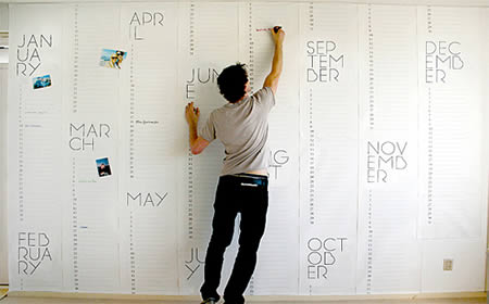
Wallpaper Calender

Dutch designer Christiaan Postma designed this wallpaper to do double duty as a giant calendar. The design merges the properties of wallpaper with the functionality of the calendar to create a wall that is a true reflection of our busy schedules. By making the calendar so large you can literally look at one whole year on your wall, giving an entirely different perspective of time.(Link)
This wallpaper called Pocket Wall by designer Maja Ganszyniec is like a wrapping paper. The project turns the purely decorative layer of wallpaper into storage. (Link) See more creative wallpapers here