 I have been looking at the impossible drawings of M. C. Escher in relation to a typographic restaurant brief I have been completing. I found this interpretation of his work in regards to a typeface in which each letter reflects a different Escher masterpiece
Tuesday, 7 December 2010
Escher Alphabet
I have been looking at the impossible drawings of M. C. Escher in relation to a typographic restaurant brief I have been completing. I found this interpretation of his work in regards to a typeface in which each letter reflects a different Escher masterpiece

Monday, 22 November 2010
Preliminary Thoughts on a Surrealist Menu.
I like the idea of written thoughts and scribbles, rough sketches and expressions on a page, being taken into 'formal' typography. Expressive typography that really lives and breathes what is being written. (see pics)
Surrealism is said to be the 'total liberation of the mind.' In terms of the typographic restaurant brief thought about how the actual act of choosing something on a menu is taxing on the mind and is definitely not liberating.
What if a menu didn't list endless dishes and side orders, extras, specials, appetisers etc, but rather provoked a feeling or thought. A menu could be descriptive of the sensory experience of eating/drinking, and by simply reading or reciting the menu, would be sufficient in providing the sensory experience. Does a surreal restaurant have food?or is the food in the mind of the consumer? Is it fair to say you could be full if you imagined you were full?Does imagining eating and going through the sensory experience replicate actually doing it, or perhaps enhances it? What if the menu was instructional, a script perhaps? the guest would be instructed to read from the menu and whatever they said would be what the received on a 'plate' (or not as the case may be).
 Richard Hamilton, typographical represention of Marcel Duchamp's 'The Green Box"

Robert Brownjohn, instructional poem on NYC
Letter and Image


Work of Robert Massin (above)
Letter and Image is a book I have been directed towards and is written by Robert Massin. Massin is a french designer best known for his seminal works with expressive typography, namely, La Cantatrice chauve (translated as The Bald Prima Donna or The Bald Soprano), and has been influential to many designers including the likes of Paula Scher.


Some interesting ideas emerged whilst reading the book. Massin highlights the idea that the letter is lost within the word, the job of the letter is to be perceptible yet invisible, silent, and yet a mental projection of speech, "a letter on paper has only the weight of ink" it's principle job to be as unobtrusive as possible, but what happens when the letter becomes obtrusive? if we dissect the word, untie the links between letters and let them stand alone like a building or a monument. Removed from the word and it's semantic implications, the letter becomes an entity in itself. At what point does an image become a letter?or a letter become an image? The fine line between the two can be seen here
This is something I wish to explore within this project.The idea of letters having their own sense of space, perspective, shadow, time, playing with light and dark. The letter as image, as architecture, as experience.
Typographically Surreal.
Sunday, 21 November 2010
Barney Bubbles - Reasons To Be Cheerful.

 I first came across Barney Bubbles when Hitch (my tutor) imparted some of his creative influences to us in a lecture, therefore I was really looking forward to hear a lecture from the author of the book, 'Barney Bubbles: Reasons To be Cheerful,' Paul Gorman.
Not only did Gorman show us a selection of Barney Bubbles fantastic work but he also gave us an insight into the man behind the work. Gorman talks of Bubbles placing great importance on his privacy, perhaps to his detriment, in that despite being a talented designer, he did not become as successful as he might if he had been less private. Gorman spoke of Bubbles fondly and it was clear that he had an emotional attachment to the creation of the book. Gorman not only seemed to know Bubbles' work thoroughly but also seemed to understand him as a person. The title 'Reasons To Be Cheerful,' is ironic as Bubbles eventually committed suicide, it was quite moving to hear Gorman speak of this, as it was clearly a something very personal to him and for Bubbles to create such bright and uplifting work, despite being depressed is a tantamount to his privateness. Even the cover of the book was designed by Gorman's wife. Gorman gave a thorough, interesting, engaging talk about Barney Bubbles' life and work and I think he represented his legacy perfectly.

Teal Triggs Lecture
 Teal Triggs came to talk to us about her recently released book entitled 'fanzines.' I thought that her research on the subject was of course impressive and she had covered an extensive range of zines from all over the world. I expected Triggs to gives us a little more of an insight into zine culture, rather than talk us through the titles of a long list of zines and for this reason I found the lecture less interesting. I do engage with zines and having an avid interest in photo-montage come hand in hand with zine culture with artist such as Linder Sterling and I have made some myself in the past, they are a great way of collating together information and some of the better ones are great for making political and social statements. I think if Triggs had spoken more extensively about the sub-culture of zines this would have been more interesting, but instead I found the talk quite tedious towards the end.
Bracketpress, MMU Special Collections,
These Beautiful print and paper examples were displayed at an exhibition in MMU Library. A Sensitive approach to image and typography typography, Featured artists: Penny Rimbaud, Alice Smith, Christian Brett, (BracketPress) and more. This exhibition was when I first came across the work of Alice Smith and Christian Brett, who form Bracketpress. I absolutely loved the work, which I saw and thought how fantastic it would be to visit 'Bracketpress' and see the behind the scenes workings of such work.
Little did I know that getting in touch with Alice Smith for my dissertation that this would lead to me working with Alice on a collaborative project for The Idler. The project began as one illustration and has now spiraled into a fantastically exciting project, for which we now have 17 pages between us in The Idler. The plan is to create a limited edition pamphlet, which will separately showcase the work we have created along with text, which is yet to be confirmed. This is so exciting and after having the inkling of wanting to work with Bracketpress I will now have my very own Pamphlet being sold on the Bracketpress website and at The Idler Academy, Notting Hill, London. So far it has been a pleasure working with Alice and Christian and I have learnt so much and The Idler is close to being sent to print!


Recorders
Manchester Art Gallery,
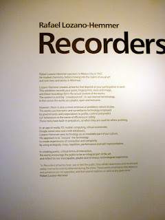


Finally, I have been to see the 'Recorders' exhibition at The Manchester Art Gallery. I thoroughly enjoyed the interactive element of the exhibition, this combined with my obsession with recording devices enhanced the experience. I have officially bookmarked Rafael Lozano-Hemmer.
Subscribe to:
Posts (Atom)

 Posts
Posts

