Pages

Monday, 22 November 2010

Preliminary Thoughts on a Surrealist Menu.

I like the idea of written thoughts and scribbles, rough sketches and expressions on a page, being taken into 'formal' typography. Expressive typography that really lives and breathes what is being written. (see pics)
Surrealism is said to be the 'total liberation of the mind.' In terms of the typographic restaurant brief thought about how the actual act of choosing something on a menu is taxing on the mind and is definitely not liberating.
What if a menu didn't list endless dishes and side orders, extras, specials, appetisers etc, but rather provoked a feeling or thought. A menu could be descriptive of the sensory experience of eating/drinking, and by simply reading or reciting the menu, would be sufficient in providing the sensory experience. Does a surreal restaurant have food?or is the food in the mind of the consumer? Is it fair to say you could be full if you imagined you were full?Does imagining eating and going through the sensory experience replicate actually doing it, or perhaps enhances it? What if the menu was instructional, a script perhaps? the guest would be instructed to read from the menu and whatever they said would be what the received on a 'plate' (or not as the case may be).
Richard Hamilton, typographical represention of Marcel Duchamp's 'The Green Box"
Robert Brownjohn, instructional poem on NYC

Letter and Image

Work of Robert Massin (above)
Letter and Image is a book I have been directed towards and is written by Robert Massin. Massin is a french designer best known for his seminal works with expressive typography, namely, La Cantatrice chauve (translated as The Bald Prima Donna or The Bald Soprano), and has been influential to many designers including the likes of Paula Scher.
Some interesting ideas emerged whilst reading the book. Massin highlights the idea that the letter is lost within the word, the job of the letter is to be perceptible yet invisible, silent, and yet a mental projection of speech, "a letter on paper has only the weight of ink" it's principle job to be as unobtrusive as possible, but what happens when the letter becomes obtrusive? if we dissect the word, untie the links between letters and let them stand alone like a building or a monument. Removed from the word and it's semantic implications, the letter becomes an entity in itself. At what point does an image become a letter?or a letter become an image? The fine line between the two can be seen here
This is something I wish to explore within this project.The idea of letters having their own sense of space, perspective, shadow, time, playing with light and dark. The letter as image, as architecture, as experience.
Typographically Surreal.

Sunday, 21 November 2010

Barney Bubbles - Reasons To Be Cheerful.

I first came across Barney Bubbles when Hitch (my tutor) imparted some of his creative influences to us in a lecture, therefore I was really looking forward to hear a lecture from the author of the book, 'Barney Bubbles: Reasons To be Cheerful,' Paul Gorman.
Not only did Gorman show us a selection of Barney Bubbles fantastic work but he also gave us an insight into the man behind the work. Gorman talks of Bubbles placing great importance on his privacy, perhaps to his detriment, in that despite being a talented designer, he did not become as successful as he might if he had been less private. Gorman spoke of Bubbles fondly and it was clear that he had an emotional attachment to the creation of the book. Gorman not only seemed to know Bubbles' work thoroughly but also seemed to understand him as a person. The title 'Reasons To Be Cheerful,' is ironic as Bubbles eventually committed suicide, it was quite moving to hear Gorman speak of this, as it was clearly a something very personal to him and for Bubbles to create such bright and uplifting work, despite being depressed is a tantamount to his privateness. Even the cover of the book was designed by Gorman's wife. Gorman gave a thorough, interesting, engaging talk about Barney Bubbles' life and work and I think he represented his legacy perfectly.

Teal Triggs Lecture

Teal Triggs came to talk to us about her recently released book entitled 'fanzines.' I thought that her research on the subject was of course impressive and she had covered an extensive range of zines from all over the world. I expected Triggs to gives us a little more of an insight into zine culture, rather than talk us through the titles of a long list of zines and for this reason I found the lecture less interesting. I do engage with zines and having an avid interest in photo-montage come hand in hand with zine culture with artist such as Linder Sterling and I have made some myself in the past, they are a great way of collating together information and some of the better ones are great for making political and social statements. I think if Triggs had spoken more extensively about the sub-culture of zines this would have been more interesting, but instead I found the talk quite tedious towards the end.

Bracketpress, MMU Special Collections,

These Beautiful print and paper examples were displayed at an exhibition in MMU Library. A Sensitive approach to image and typography typography, Featured artists: Penny Rimbaud, Alice Smith, Christian Brett, (BracketPress) and more. This exhibition was when I first came across the work of Alice Smith and Christian Brett, who form Bracketpress. I absolutely loved the work, which I saw and thought how fantastic it would be to visit 'Bracketpress' and see the behind the scenes workings of such work.
Little did I know that getting in touch with Alice Smith for my dissertation that this would lead to me working with Alice on a collaborative project for The Idler. The project began as one illustration and has now spiraled into a fantastically exciting project, for which we now have 17 pages between us in The Idler. The plan is to create a limited edition pamphlet, which will separately showcase the work we have created along with text, which is yet to be confirmed. This is so exciting and after having the inkling of wanting to work with Bracketpress I will now have my very own Pamphlet being sold on the Bracketpress website and at The Idler Academy, Notting Hill, London. So far it has been a pleasure working with Alice and Christian and I have learnt so much and The Idler is close to being sent to print!

Recorders

Manchester Art Gallery,
Awaiting your input.
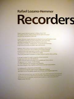
Finally, I have been to see the 'Recorders' exhibition at The Manchester Art Gallery. I thoroughly enjoyed the interactive element of the exhibition, this combined with my obsession with recording devices enhanced the experience. I have officially bookmarked Rafael Lozano-Hemmer.

DR. ME Do Urban Outfitters.

Intrigued by how an exhibition could work in Urban Outfitters, I took the trip to Market St, Manchester to find out. The exhibition was held in between two floors in the corner of the staircase. After deciding I was one of the lesser trendy people there and trying to avoid being filmed on camera and photographed at an unflattering angle (failing), I stood back to admire the work entitled, 'like wat kids do.' I really liked the aesthetic of the work, mixing collage techniques with graphic design. I could relate this style of work with my own, it was nice to see the work in a purely aesthetic context and I would be interested to see how this style of work could be applied to a commercial situation.

Gastrotypographicassemblage.

In 1965 Lou Dorfsman and Frank Stanton stood contemplating the black wall of the blank wall of the new CBS cafeteria. The mundane design proposals submitted for the wall fell below their expectations, and they were determined to find a more original concept...
Exhibition catalogue from exhibition.
CBS feature from U&LC

iGod

I was set the brief to Re-Brand Gpd by TDR's Creative Director, Ian Anderson.

Aim:

To refresh the brand 'God' in an attempt to restore peoples existing interest in God, however small/large this may be.

Reasons why people have lost interest in God:

Mundane

Old Fashioned

Inconvenient

Traditional

Obligation

Reasons people like God:

Friendship

community

reassurance

advice

Target audience:

People who already believe in God, but perhaps don't actively worship or participate in religion because of their lifestyle and/or negative connotations of religion

Strategy:

-I thought about other ‘more fashionable’ religions i.e Kabballah, and researched what resources can be used to their full potential to spread the word of God. I asked myself how could 'God' fit into the lifestyles of people too busy to worship or go to church. I came up with the idea of a Halo band, which would allow people to feel a sense of belonging, similar to the red Kabballah bands, or festivals bands: a statement of their religion .

The device is fitted with bluetooth and similar to an oyster card the band can be touched onto terminals to enable to wearer to download sermons from their local church, or national/global sermons.

Sermons can be listened to directly form the device or the band can link to iPhone, iPad, laptop, PC, Mac etc so that the user can listen in their free time and also keep a backlog of sermons as they would with downloaded music.

Would this destroy the ‘sense of community' that religion offers?

The band can also be used to share information between people, by touching wrists, the touching of wrists gives off more positive connotations of ‘me and God are mates’ rather than the previous negative connotations of praying i.e subservient. The band would promote a sense of religious community not just ‘in the church’ but all the time between people who meet and interact with each other in day to day life.

If this was a campaign in real life, the most popular and widely distributed brand to carry it out would be apple- therefore I came up with the concept, iGod

Final Poster, submitted to Grafik magazine

Wednesday, 17 November 2010

Du Ho Soh

Bridging Home is a scale model of the artist's own Korean house from his childhood wedged between two buildings on Duke Street, Liverpool.

Friday, 12 November 2010

Katherine McCoy

Beautiful work from an iconic female designer. See 'Cranbrook Academy of Art' (I can only dream of one day attending)

Damien Hirst, PHARMACY Restaurant + Bar

Designers and restaurants. Something I have been pondering in my consideration of the ISTD brief: Muttod Quad, my task? To design a typographic restaurant. I am undecided as to whether this brief is a branding venture, an interior design challenge, research into 'Alphabetti Spaghetti' or a way to use a specific topic, in this case, Gastronomy and explore it typographically.
I am leaning towards the latter. A branding task may be appropriate if asked to re-design a restaurant, but this notion of a typographic restaurant, suggests the need for more than understated elegance and culinary clichés. Perhaps clichés will be embraced, exaggerated, exploited or avoided completely. Does the restaurant have to physically exist, could it be a fantasy land, magical, surreal? What would a typographic waiter look like? how would the walls be decorated?Lampshades, cutlery, candles, menus, bar signs etc etc....the possibilities are endless.
As a starting point I have been looking at Damien Hirst's Pharmacy Restaurant + Bar, Hirst has taken the theme of pharmaceuticals and applied it to a restaurant environment. The venue appears clinical, sanitary, stark, yet there is something intriguing an complex about display cabinets of over the counter drugs, signage in turquoise neon and chairs of waiting room standard, a complete parody of a pharmacy. The whole experience seems as though it would be quite jarring and possibly unenjoyable, but at least you can say 'I went to Damien Hirst's Pharmacy' I have no idea if the food tastes good, but is that what the 'Designer's Restaurant' is about. Who cares what the food tastes like as long as it's making history? Hirst's restaurant opened in Notting Hill, London in 1997. After breaching the Medicines Act, 1968, which restricts the use of "pharmacy". The restaurant's name was subsequently changed to "Army Chap", and then "Achy Ramp": anagrams of "Pharmacy". The restaurant itself closed in September 2003. Hirst, who had only loaned the restaurant the artwork on display on the premises, went on to pocket over £11 million when the items were auctioned at Sotheby's

Wallpaper Calender

Dutch designer Christiaan Postma designed this wallpaper to do double duty as a giant calendar. The design merges the properties of wallpaper with the functionality of the calendar to create a wall that is a true reflection of our busy schedules. By making the calendar so large you can literally look at one whole year on your wall, giving an entirely different perspective of time.(Link)
This wallpaper called Pocket Wall by designer Maja Ganszyniec is like a wrapping paper. The project turns the purely decorative layer of wallpaper into storage. (Link) See more creative wallpapers here